Mean Value vs. Window – Plot

There are now 17,330 individual time series monitored by The Bubble Index; each with a full range of windows. The windows range from 52 to 35,500 days. Below is plotted the natural log of the mean value (y-axis) versus the window (x-axis). Each window’s mean value represents the mean calculated over the entire historical record for all 17,330 time series.

Natural Log


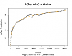
The curve of best fit displayed above is:

ln(y) = a + b * ln(x), where y represents the mean value outputted by The Bubble Index software and x represents the window.

a = -9.746393

b = 3.613444

Taking this function and rearranging the terms produces:

y = exp(a) * x ^ b, where y represents the mean value outputted by The Bubble Index software and x represents the window. (constants a and b are as above).

Exponential


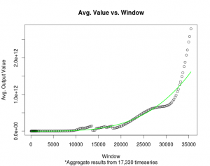
To incorporate this information into the plots, the mean value for a given window will have Relative Power = 50.0 In other words, the output to the previous equation, which calculates the mean value for a given window, will be displayed on the website’s plots as 50.0

The next step will be to calculate an empirical distribution for each window.

Download the pdfs:

Natural Log Plot

Exponential Plot

Elliott Wave Count and LPPL Oscillations

In the following chart, you can see a relationship between The Bubble Index and Elliott Waves. The Elliott Wave Count is from the ELLIOTT WAVE lives on; the blog of Anthony Caldaro. His charts can be found here.

The Bubble Index 1764 days tends to peak with Intermediate waves i, iii, and iv; while The Bubble Index 1260 days tends to peak with Major waves 1, 3, and 5.

Supercycle: Light Blue
Blue: Primary
Black: Major
Intermediate: Purple

LPPL Model Working

Honestly, I am shocked at how well The Bubble Index timed this market correction.

The Bubble Index: S&P 500 (1764 days) peaked on September 22, 2014. That was 21 days ago, the critical time variable, Tc, in the code.

Today’s S&P 500 sell-off was intense, to say the least… down 1.65%. And this wasn’t the only day with huge losses. Since the market peaked on September 19th, it has lost about 10%.

Commodity Fetishism, Bubbles, and Elliott Waves

Perhaps a connection between these ideas? This quote from Wikipedia’s page on commodity fetishism triggered a curiosity:

The value of a commodity originates from the human being’s intellectual and perceptual capacity to consciously (subjectively) ascribe a relative value (importance) to a commodity, the goods and services manufactured by the labour of a worker. Therefore, in the course of the economic transactions (buying and selling) that constitute market exchange, people ascribe subjective values to the commodities (goods and services), which the buyers and the sellers then perceive as objective values, the market-exchange prices that people will pay for the commodities.

Read here for more information on commodity fetishism. I saw Dr. Rodrigue’s plot while reading more about Karl Marx’s commodity fetishism on Wikipedia. Dr. Jean-Paul Rodrigue’s blog (where there is commentary on market bubbles) contains the following graphic:

There are many ideas in my mind after reading and thinking about the connections between commodity fetishism, bubbles, and Elliott Waves. In addition, the plot of bubble phases by Dr. Rodrigue’s has a clear connection with the 5 wave impulse and 3 wave correction. I need to think more about some of these ideas and formulate some clearly written ideas.

S&P500 and DJIA – Week Ending May 28, 2013

S&P 500

Week ending May 28, 2013.

Based on the figures, there appears to be no indication of a current bubble.

SP500 Bubble Index (52 weeks)
  1. 10/07/1974
  2. 01/11/1988
  3. 01/12/2009
SP500 Bubble Index (104 weeks)
  1. 06/08/2009
SP500 Bubble Index (260 weeks)
  1. 04/09/1956
  2. 03/02/1987
  3. 02/01/1999
  4. 10/05/2009
SP500 Bubble Index (364 weeks)
  1. 02/01/1960
  2. 09/08/1987
  3. 09/11/2000
  4. 08/08/2011
SP500 Bubble Index (520 weeks)
  1. 04/30/1990
  2. 10/09/2000

Dow Jones Industrial Average

Week ending May 27, 2013.

Based on the figures, there appears to be no indication of a current bubble.

DowJones Bubble Index (52 weeks)
  1. 07/15/1932
  2. 12/26/2008
DowJones Bubble Index (260 weeks)
  1. 01/27/1933
  2. 07/10/1987
  3. 07/17/1998
DowJones Bubble Index (364 weeks)
  1. 05/08/1908
  2. 11/01/1929
  3. 12/14/1934
  4. 01/13/1956
  5. 09/11/1987
  6. 02/25/2000
DowJones Bubble Index (520 weeks)
  1. 11/30/1934
  2. 03/18/1938
  3. 06/27/1958
  4. 06/29/1990
  5. 08/25/2000
DowJones Bubble Index (1040 weeks)
  1. 05/23/1930
  2. 03/15/1935
  3. 06/07/1940
  4. 09/13/1957
  5. 01/05/1990
  6. 07/21/2000

Gold – Week Ending May 20, 2013

May 20, 2013:

The bubble index for the price of gold, shown in the following figures, indicates that gold is undergoing a bubble. Based on my data, although limited to 2001-2013 the bubble index has traveled continuously upward. If I can find better weekly data for the price of gold, then this upward trend can be properly put into perspective. Or, the code may not be properly designed for commodity prices. The price data is not inflation adjusted.

Figure 1

Figure 1 shows the bubble index for the price of gold. One year window. The red line corresponds to the following (ignore the dates on the graph, they are incorrect):
1. September 8, 2006 – followed by an 8.6% drop shortly after
2. July 19, 2008 – followed by a 28% drop
3. August 19, 2011 – followed by a 13% drop

Figure 2

Figure 2 shows the bubble index for the price of gold. Three year window. The red line corresponds to the following:
1. July 11, 2008 – followed by a 25% drop

Figure 3

Figure 3 shows the bubble index for the price of gold. Six year window.

Figure 4

Figure 4 shows the bubble index for the price of gold. Seven year window.

BSE SENSEX – Week Ending May 10, 2013

May 10, 2013:

I do not see any chances of there being a bubble in the BSE SENSEX Index at this time. Seems quiet…

Figure 1

Figure 1 produced with C++ code. BSE SENSEX Index. Six year window of data. Every data point is a new week. Every peak in the market is represented by a red vertical line.
1. May 12, 2008 – followed by a 22.8% drop
2. October 12, 2009 – followed by an 8% drop
3. December 27, 2010 – followed by a 13.7% drop

Figure 2

Figure 2 produced with C++ code. BSE SENSEX Index. Seven year window of data. Every data point is a new week. Every peak in the market is represented by a red vertical line.
1. January 7, 2008 – followed by a drop in excess of 28%
2. October 12, 2009 – followed by an 8% drop
3. December 27, 2010 – followed by a 13.7% drop

Nikkei – Week Ending May 10, 2013

May 10, 2013:

I do not see any chances of there being a bubble in the Nikkei Index at this time. Although, there appears to have been a recent bubble.

Figure 1

Figure 1 produced with C++ code. Nikkei Index. Seven year window of data. Every data point is a new week. Every peak in the market is represented by a red vertical line.
1. June 24, 1996 – followed by a 23.2% drop
2. May 20, 2002 – followed by a 35.7% drop
3. September 29, 2008 – followed by a 34% drop
4. March 29, 2010 – followed by a 20% drop
5. March 12, 2012 – followed by a 16.7% drop

Figure 2

Figure 2 produced with C++ code. Nikkei Index. Six year window of data. Every data point is a new week. Every peak in the market is represented by a red vertical line.
1. May 1, 1995 – followed by a 15% drop
2. November 18, 1996 – followed by a 18% drop
3. September 17, 2001 – exact bottom of downturn (or perhaps related to Sept. 11, 2001)
4. March 29, 2010 – followed by a 20% drop
5. March 12, 2012 – followed by a 16.7% drop