Bitcoin Phase-Change Prediction Analysis

On December 20th, 23rd, and 29th The Bubble Index: Bitcoin/USD 52, 104, and 153 day indices, respectively, peaked. This means that the derivative reached zero and indicates that the phase-change probability would be highest in 21 days. Thus, on January 7th I predicted that we will see a phase change in 21 days from the point of those local peaks. In other words, the greatest probability for a phase change would occur between the days January 9th and 18th. There was some personal uncertainty because the longer term indices (512 – 1764 day indices) had yet to reach a local peak.

At its height, the Bitcoin/USD exchange rate was around $19700 on December 17, 2017. When the 52, 104, and 153 day indices peaked the exchange rate closed at $17340, $13174, and $14323.

Looking at the exchange rate data after January 7th, the most noticeable movement was the large draw-down which started on January 6th and still continues. If we look at the closing rate on January 9th: $14920 and compare it to $8317, the price at its low on February 2nd, we see a draw-down of 44.26%.

Based on this draw-down I would conclude that the prediction on January 7th, based solely on The Bubble Index’s quantitative output, was accurate and it remains to be seen what will happen to the Bitcoin/USD exchange rate, now that the longer term indices have peaked. My personal opinion is that the rate will continue its downward progression until it reaches significant support, perhaps at the $6000 or $4000 level.

Mean Value vs. Window – Plot

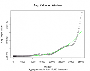
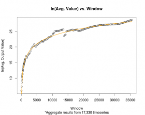
There are now 17,330 individual time series monitored by The Bubble Index; each with a full range of windows. The windows range from 52 to 35,500 days. Below is plotted the natural log of the mean value (y-axis) versus the window (x-axis). Each window’s mean value represents the mean calculated over the entire historical record for all 17,330 time series.

Natural Log


The curve of best fit displayed above is:

ln(y) = a + b * ln(x), where y represents the mean value outputted by The Bubble Index software and x represents the window.

a = -9.746393

b = 3.613444

Taking this function and rearranging the terms produces:

y = exp(a) * x ^ b, where y represents the mean value outputted by The Bubble Index software and x represents the window. (constants a and b are as above).

Exponential


To incorporate this information into the plots, the mean value for a given window will have Relative Power = 50.0 In other words, the output to the previous equation, which calculates the mean value for a given window, will be displayed on the website’s plots as 50.0

The next step will be to calculate an empirical distribution for each window.

Download the pdfs:

Natural Log Plot

Exponential Plot

Three.js 3D Contour Plot – Part 1

Three.js is a powerful tool for visualizing a wide variety of objects including mathematical data. The JavaScript based API greatly simplifies the creation and manipulation of WebGL graphic objects. This post is the first in a series which describe the creation of The Bubble Index 3D Contours. The first step is to check if the user’s device supports WebGL. The Detector variable comes from AlteredQualia and Mr.Doob. If the device supports WebGL, it is time to initialize variables:

if ( ! Detector.webgl ) Detector.addGetWebGLMessage();
var renderer; 
var texture; 
var scene;     
var camera;   
var controls;
var axes;
var model; 
var container;
var rotateX = 0;   
var rotateY = 0;

init();

The first important code is called by the init() function. This code creates the director’s camera; the user is like a film director. The camera is the amount, perspective, and angle of the 3D scene displayed on the screen. The camera is controlled by a control object which allows the user to interact via the keyboard and mouse. To display anything, a scene needs to be created. Objects need to be added to the scene in order for them to become visible. The renderer does all the work to actually turn the code objects, numbers, and interactions into colors and shapes displayed on the screen via the device’s graphics card and WebGL.

In order to draw a 3D contour, a set of geometric data needs to be created. The data defines vertices and faces of polygons which tell Three.js how to draw a shape. The Bubble Index 3D Contour displays parallel time-series by first turning them into a set of X,Y,Z coordinates. It then sends these coordinates to 3DFieldPro which outputs a dxf AutoCAD file. The dxf file is then converted into a Three.js JSON 3D data structure via the JNetCAD program. Thus, with the JSON data created, the THREE.JSONLoader() provides a convenient way to load and display the 3D contour data.

In future posts, the addAxesAndText() and addTimeSeries() functions will be discussed. They simply add the axes and the price data time-series to the display.

Finally, the renderer needs to be added to the HTML DOM. A window listener function is created to provide a means to redraw the display in the case of a resize of the browser.

function init() {
    camera = new THREE.PerspectiveCamera(50, window.innerWidth / window.innerHeight, 0.1, 1000);
    camera.position.z = 35;
    camera.up.set( 0, 0, 1 );
    controls = new THREE.OrbitControls( camera );
    controls.damping = 0.5;
    controls.addEventListener( 'change', render );
    scene = new THREE.Scene();
    renderer = new THREE.WebGLRenderer( {  antialias: true   } );
    renderer.setPixelRatio( window.devicePixelRatio );
    renderer.setSize( window.innerWidth, window.innerHeight );
    renderer.setClearColor(0);
    var loader = new THREE.JSONLoader();
    loader.load('AA.BA.json', modelLoadedCallback);

    addAxesAndText();
    addTimeSeries();

    container = document.getElementById( 'container' );
    container.appendChild( renderer.domElement );
    window.addEventListener( 'resize', onWindowResize, false );
    animate();
 }

D3.js Multiple Line Plot – Part 6

Working version of the plot, download here.

This final post describes the code which needs to be executed after any time-series has been added or removed. When a time-series has been added or removed via the legend button, it is possible that its unique range of y-values is not currently displayed in the plot. For instance, assume the “52 Days” and “104 Days” time-series are currently displayed and the y-range is: [0 – 123]. Now, the “2520 Days” time-series is added by a mouse click. This time series has y-values in the range [420 – 540]. Thus, the new range [0 – 540] needs to be established as the new y-axis. However, all the time-series displayed “pre-click” (52 and 104 Days) will need to be removed and re-drawn since their paths are scaled based on the [0 – 123] range of y-values. As seen in part 4, if the legend button is black with a strike-through, the addWindow() function is called:

function addWindow(name, addAllBoolean, updateBoolean, longTransition) {
    var transition = longTransition ? 500 : 0;
    if (svg.selectAll(".index").empty() || !svg.selectAll(".index").classed("a" + name) || updateBoolean) {
        var idName = name.toString();
        var tempIndex = svg.selectAll(".aaa")
            .data(indices.filter(function(d) {
                return d.name == idName;
            }))
            .enter().append("g")
            .attr("id", function(d) {
                return "index" + d.name;
            })
            .attr("class", function(d) {
                return "index a" + d.name;
            });
        if (!addAllBoolean) {
            var displayedIndices = d3.selectAll(".index").data();
            y.domain([
                d3.min(displayedIndices, function(c) {
                    return d3.min(c.values, function(v) {
                        return v.yvalue;
                    });
                }),
                d3.max(displayedIndices, function(c) {
                    return d3.max(c.values, function(v) {
                        return v.yvalue;
                    });
                })
            ]);
            svg.select(".y.axis")
                .call(yAxis);
            d3.selectAll(".index").data().forEach(function(d) {
                removeWindow(d.name, false, false);
                (d.name == name) ? addWindow(d.name, true, true, true): addWindow(d.name, true, true, false);

            });
        }
        tempIndex.append("path")
            .attr("class", "line")
            .attr("d", function(d) {
                return line(d.values);
            })
            .style("opacity", 0.0)
            .style("stroke", function(d) {
                return color(d.name);
            })
            .transition()
            .style("opacity", 1.0)
            .duration(transition);
    }
}

As can be seen by the addWindow() function, in order to add a window, all previous windows need to be removed. If the window is currently displayed, it can be removed with a mouse click. There are two types of addWindow() and removeWindow() function calls. The logic is based on various boolean values. This is needed because of the “Add All” and “Remove All” buttons. These buttons require a different logic than the case of a single time-series being added or removed. Presented below is the removeWindow() function:

function removeWindow(name, longTransitionBoolean, firstClick) {
    var transition = longTransitionBoolean ? 500 : 0;
    var idName = "#index" + name.toString();
    d3.select(idName)
        .transition()
        .style("opacity", 0.0)
        .duration(transition)
        .remove().each("end", function() {
            if (firstClick) {
                var displayedIndices = d3.selectAll(".index").data();
                if (!d3.selectAll(".index").empty()) {
                    y.domain([
                        d3.min(displayedIndices, function(c) {
                            return d3.min(c.values, function(v) {
                                return v.yvalue;
                            });
                        }),
                        d3.max(displayedIndices, function(c) {
                            return d3.max(c.values, function(v) {
                                return v.yvalue;
                            });
                        })
                    ]);
                    svg.select(".y.axis")
                        .call(yAxis);
                    d3.selectAll(".index").data().forEach(function(d) {
                        removeWindow(d.name, false, false);
                        addWindow(d.name, true, true, false);

                    });
                    addMouse();
                }
            }
        });

In each of these functions, the D3 transition function is called in order to make the addition and remove of the time-series lines smooth.
This concludes the posts concerning drawing multiple line plots with mouse interaction in D3.js. Hope this helps!

D3.js Multiple Line Plot – Part 5

Working version of the plot, download here.

The D3 function, d3.mouse(), provides a convenient tool for tracking the movement of the mouse as the user interacts with the plot. The nearest time x-value is determined and used to display the corresponding y-values for each time-series displayed. The mousemove() function was initialized in part 1 as follows:

function mousemove() {
    var x0 = x.invert(d3.mouse(d3.select("#svgMain").node())[0]);
    var i = bisectDate(origData, x0, 1);
    d3.selectAll(".index").data().forEach(function(d) {
        var d0 = d.values[i - 1],
            d1 = d.values[i],
            p = x0 - d0.date > d1.date - x0 ? d1 : d0;
        var x_new = x(p.date),
            y_new = y(p.yvalue);
        svg.select("#focus" + d.name).attr("transform", "translate(" + x_new + "," + y_new + ")");
        svg.select("#numtext" + d.name).text(p.yvalue);
				svg.select("#datetext").text(dateDisplayFormat(p.date));
    });
}

The code in part 4 displayed where the mousemove() function is first called.

Next, add html and svg elements which draw circles and append text to the plot display at the location and value of the data points. These objects will follow the movement of the mouse. The location of the nearest Date will be fixed in the top center of the plot; its value will change accordingly as the mouse moves. Each time-series line currently displayed on the plot will need to have a “rect” appended to it, as shown below:

var addMouse = function() {
    focus = svg.selectAll(".index").append("g")
        .attr("id", function(d) {
            return "focus" + d.name;
        })
        .attr("class", function(d) {
            return "focus " + d.name;
        })
        .style("display", "none");
    focus.append("circle")
        .attr("id", function(d) {
            return "circle" + d.name;
        })
        .attr("r", 4.5);
    focus.append("text")
        .attr("id", function(d) {
            return "numtext" + d.name;
        })
        .attr("x", 9)
        .attr("dy", "-0.5em");
    svg.append("text")
        .attr("id", "datetext")
        .attr("x", width / 2);
    svg.selectAll(".index").append("rect")
        .attr("class", function(d) {
            return "overlay " + d.name;
        })
        .attr("width", width)
        .attr("height", height)
        .on("mouseover", function() {
            focus.style("display", null);
        })
        .on("mouseout", function() {
            focus.style("display", "none");
        })
        .on("mousemove", mousemove);
}

The circles that trace the multiple plot lines will appear and disappear as the mouse moves onto and off the plot. This is associated with the following CSS style code:

.overlay {
  fill: none;
  pointer-events: all;
}
.focus circle {
  fill: none;
  stroke: steelblue;
}

D3.js Multiple Line Plot – Part 4

Working version of the plot, download here.

This post discusses the code responsible for creating an interactive legend for a multiple line plot — as seen on the Plot page of The Bubble Index. The legend will be located below the plot. In order to create an area to contain room for the legend’s text, the plot display must not fill the entire height of the svg object. As seen in part 1, the plot has a bottom margin of size 100 and a top margin of size 20. This allows space for a legend to span the area below the plot.

var maxPerRow = Math.ceil(indices.length / 2);
var legendSpace = width / maxPerRow;

The code assumes that two rows will be enough to display all the time-series labels, including an “Add All” and “Remove All” button.

The “Add All” feature will add every time-series contained in the original data to the plot. It is like a plot “reset.” Whatever is currently displayed will be removed. Thus, the y-axis will need to be re-scaled to fit the original range of data.

svg.append("text")
    .attr("x", 0)
    .attr("y", height + (margin.bottom / 2) + 15)
    .attr("class", "legend addAll")
    .style("fill", "red")
    .text("Add All")
    .on("click", function() {
        d3.selectAll(".index").data().forEach(function(d) {
            removeWindow(d.name, false, false);
        });
        y.domain([
            d3.min(indices, function(c) {
                return d3.min(c.values, function(v) {
                    return v.yvalue;
                });
            }),
            d3.max(indices, function(c) {
                return d3.max(c.values, function(v) {
                    return v.yvalue;
                });
            })
        ]);
        svg.select(".y.axis")
            .call(yAxis);
        indices.forEach(function(d, i) {
            var myID = "legend" + d.name;
            var selection = d3.select("#" + myID);
            if (selection.attr("class") == "legend-clicked") {
                selection.style("fill", color(d.name)).attr("class", "legend " + d.name);
                addWindow(d.name, true, false, true);
            }
        });
        addMouse();
    });

The “Remove All” feature will remove all time-series currently displayed in the plot. Note: while writing this, I noticed it may not be necessary to re-scale the y-axis.

svg.append("text")
    .attr("x", 0)
    .attr("y", height + (margin.bottom / 2) + 45)
    .attr("class", "legend removeAll")
    .style("fill", "red")
    .text("Remove All")
    .on("click", function() {
        indices.forEach(function(d, i) {
            var myID = "legend" + d.name;
            var selection = d3.select("#" + myID);
            selection.style("fill", "black").attr("class", "legend-clicked");
            removeWindow(d.name, true, false);
        });
        var displayedIndices = d3.selectAll(".index").data();
        y.domain([
            d3.min(displayedIndices, function(c) {
                return d3.min(c.values, function(v) {
                    return v.yvalue;
                });
            }),
            d3.max(displayedIndices, function(c) {
                return d3.max(c.values, function(v) {
                    return v.yvalue;
                });
            })
        ]);
        svg.select(".y.axis")
            .call(yAxis);
    });

At this point in the code, the function which creates a mouse-over interaction is called. The mouse-over function will be discussed in a later post.

addMouse();

Next, a legend entry for each time-series is appended to the bottom of the svg plot. Note: In the HTML header, there is a CSS style sheet which contains a class for a legend element which has been clicked-on.

.legend {
    font-size: 16px;
    font-weight: bold;
    text-anchor: middle;
    cursor:pointer;
} 

.legend-clicked {
    font-size: 16px;
    font-weight: bold;
    text-anchor: middle;
    text-decoration: line-through;
    cursor:pointer;
}

When the user clicks on a time-series label, that particular time-series will either be removed or added, depending on the current status of that time-series. For instance, if the “52 Day” label is black and has a strike-through style, it means the time-series has been removed from the plot. Clicking on this label will add the time-series back to the plot. However, in order for this to happen, the y-axis needs to be re-scaled and all the currently displayed lines will need to be re-drawn. The functions which re-scale and update the plot will be included in a future post.

indices.forEach(function(d, i) {
    svg.append("text")
        .attr("x", legendSpace + (i % maxPerRow) * legendSpace)
        .attr("y", (i & lt; maxPerRow) ? (height + (margin.bottom / 2) + 15) : (height + (margin.bottom / 2) + 45))
        .attr("class", "legend " + d.name)
        .attr("id", "legend" + d.name)
        .style("fill", color(d.name))
        .text(d.name + " Days")
        .on("click", function() {
            var selection = d3.select(this);
            if (selection.attr("class") == "legend-clicked") {
                selection.style("fill", color(d.name)).attr("class", "legend " + d.name);
                addWindow(d.name, false, false, true);
                addMouse();
            } else {
                selection.style("fill", "black").attr("class", "legend-clicked");
                removeWindow(d.name, true, true);
            }
        });
});
D3.js Multiple Line Plot – Part 3

Working version of the plot, download here.

The data is now imported and loaded into memory. The next step is to attach each time-series to the DOM as an element. Before doing that, draw the initial axes.

Drawing the initial axes are easy with D3. Nothing too crazy, the y-axis has the text: “Relative Power.” However, note that the y-axis has been scaled (part 2) based on all the time-series. If a single time-series is removed, the y-axis should be re-scaled and re-drawn. The entire plot will also have to be re-drawn. Removing and added lines will be the subject of later posts.

    svg.append("g")
        .attr("class", "x axis")
        .attr("transform", "translate(0," + height + ")")
        .call(xAxis);

    svg.append("g")
        .attr("class", "y axis")
        .attr("transform", "translate(" + width + " ,0)")
        .call(yAxis)
        .append("text")
        .attr("y", 6)
        .attr("dy", "-.71em")
        .style("text-anchor", "end")
        .text("Relative Power");

Now the initial lines can be drawn on the plot. Since the initial state of the svg selection contains no child elements having the “.index” keyword, the D3 selection: svg.selectAll(".index") will return with an empty selection. Thus, the combination of the .data(indices) and .enter().append("g") D3 functions will append a “g” element for every map key in the index object. Each “g” element will have an “id” and “class” based on the individual time-series “name” attribute.

For each time-series object attached to the index selection, the .append("path") function will create a “path” element. This path will be drawn based on the values entry of the individual time-series map. The function(d) in the D3 callback of .attr() implicitly iterates over all key-pairs in the index selection and all key-pair in each time-series. The line and color functions were initialized in part 1.

    index = svg.selectAll(".index")
        .data(indices)
        .enter().append("g")
        .attr("id", function(d) {
            return "index" + d.name;
        })
        .attr("class", function(d) {
            return "index a" + d.name;
        });

    index.append("path")
        .attr("class", "line")
        .attr("d", function(d) {
            return line(d.values);
        })
        .style("stroke", function(d) {
            return color(d.name);
        });

D3.js Multiple Line Plot – Part 2

Working version of the plot, download here.

As mentioned before, the following code is presented “as it is” in its current version. Some functions and variables are presented out of order.

The SVG variable is created by a D3 selection. The “plotarea” <div> is selected as the element where the SVG plot will be created. A “g” element is appended to the plot. This will allow the time-series to be grouped together as a single object.

var svg = d3.select("#plotarea").append("svg")
    .attr("width", width + margin.left + margin.right)
    .attr("height", height + margin.top + margin.bottom)
    .append("g")
    .attr("transform", "translate(" + margin.left + "," + margin.top + ")")
    .attr("id", "svgMain");

The source data is of course the most important piece in the puzzle. In order to create an SVG plot containing multiple lines which each share the same set of dates, make sure that the data is formatted and aligned correctly. For instance, create a tab-separated file which contains a header entry for each column. And make sure each row contains an entry for each column. Thus, if no data is available for a specific date and column, place a value of 0, ensuring no gaps in the data. However, depending on the structure of the data, this may not work for all applications.

An example header for the tsv file: “date 52 Days 104 Days 153 Days 256 Days 512 Days”, where each “# Days” entry is separated by a tab.

Example:

date    52 Days    104 Days
2015-05-01    52.0    102.0
2015-05-02    54.0    104.0

D3 has a function called “d3.tsv” which easily requests and loads a tab-separated file into the browser memory.

Once this raw data has been loaded, the “d3.tsv” function enters a callback. This is where the data is parsed, turned into SVG objects, and loaded into a DOM element.

Since there are multiple time-series, there will be a separate map for each column. The “indices” variable contains the separate time-series as a key-value pair mapping in memory. Each column header (i.e. 52 Days) is the key for a time-series. The value entry of the “indices” map is itself another map object. This additional map object will have a set of key-value pairs between dates and numerical values. Thus, if there are 5 column headers (excluding the date column) then the “indices” object will have 5 keys. And, if there are 252 date rows, each map associated with each one of the 5 keys will have 252 date keys.

Once the data is stored as a map, the D3 “domain” functions — in combination with the D3 max and min functions — will determine the numerical and time-line ranges of ALL the time-series data.

d3.tsv("data-location_name.tsv", function(error, data) {
    color.domain(d3.keys(data[0]).filter(function(key) {
        return key !== "date";
    }));

    data.forEach(function(d) {
        d.date = parseDate(d.date);
    });

    indices = color.domain().map(function(name) {
        return {
            name: name.substring(0, name.indexOf(" Days")),
            values: data.map(function(d) {
                return {
                    date: d.date,
                    yvalue: +d[name]
                };
            })
        };
    });
    origData = data;
    x.domain(d3.extent(data, function(d) {
        return d.date;
    }));

    y.domain([
        d3.min(indices, function(c) {
            return d3.min(c.values, function(v) {
                return v.yvalue;
            });
        }),
        d3.max(indices, function(c) {
            return d3.max(c.values, function(v) {
                return v.yvalue;
            });
        })
    ]);

D3.js Multiple Line Plot – Part 1

To help any one interested in creating “multi-line” or multiple line charts with D3.js, I will walk through the various steps required to create the D3 plots on The Bubble Index. There may be many places in my code which could be simplified and improved — I present the current version “as it is.”

Working version of the plot, download here.

The goal is to have the SVG plot fill the width of any screen which accesses the site. The HTML code contains a “plotarea” <div> which has its CSS width property set to: width = 100%. Note: this uses jQuery to select the <div>, but certainly there are other ways to select the <div>. Therefore, no matter how wide the screen on the device, the “areawidth” variable will store that information. This code setup means that the “plotarea” will only resize itself after a page resize and refresh F5, which is ok for my purposes. The aspect ratio and margins are set to visually appealing values.

The next lines contain the following useful functions:

  • D3 date parser to extract date objects from the time-series data
  • D3 scale functions to ensure that the time-series data for each time-series is always scaled with the SVG in the x and y directions
  • D3 line function to draw the lines on the SVG — “basis” interpolation method
  • D3 bisector function to be used in coordination with mouse-over events to determine the nearest “x” value of the current position of the cursor
var index;
var origData;
var indices;
var focus;
var margin = {
        top: 20,
        right: 80,
        bottom: 100,
        left: 50
    },
    aspect = 1.92,
    areawidth = $("#plotarea").width(),
    width = areawidth - margin.left - margin.right,
    height = Math.round(areawidth / aspect) - margin.top - margin.bottom;

var parseDate = d3.time.format("%Y-%m-%d").parse;

var x = d3.time.scale()
    .range([0, width]);

var y = d3.scale.linear()
    .range([height, 0]);

var color = d3.scale.category10();

var dateDisplayFormat = d3.time.format("%Y-%m-%d");

var xAxis = d3.svg.axis()
    .scale(x)
    .orient("bottom");

var yAxis = d3.svg.axis()
    .scale(y)
    .orient("right");

var line = d3.svg.line()
    .interpolate("basis")
    .x(function(d) {
        return x(d.date);
    })
    .y(function(d) {
        return y(d.yvalue);
    });

var bisectDate = d3.bisector(function(d) {
    return d.date;
}).left;

Shenzhen and Shanghai Market Bubble

The screenshots below were taken from The Bubble Index Plot from the most recent update, July 5, 2015. The bubble in the Chinese mainland shares was noticable. The short term windows show rapid increases starting in December 2014. The China 50 and China 95 plots are the composite indices formed by calculating the 50% and 95% distribution value of the daily values for The Bubble Index for all stocks monitored on both the Shenzhen and Shanghai exchanges.

The Bubble Index Composite: China 95%
The Bubble Index Composite: China 50%
The Bubble Index: 000001.SS